I wanna briefly divert from my usual range of topics to share my knowledge on a recurring topic in my professional work at iteratec; Material Theming with Angular. More precisely,
- the basic setup you need to get it to work, along with some self-declared best practices,
- and how to switch between different themes at runtime (e.g. light / dark mode).
I’ve also set up a project over on GitHub encompassing all examples from this article. The project uses Angular 11, the most recent stable Angular version at the time of writing.
So, without further ado, let’s get started with…
Part I: The Basics
Goals
Before we go rushing into the measures we’re going to employ to further them, let’s reflect on our goals behind using Material Theming real quick. Usually, what I want to get out of the theming mechanics is
- application-wide theme awareness, i.e. every UI element reacting to potential changes to a centrally defined color scheme. This is always a good idea, as it increases maintainability. Taking it a step further, so does the
- decoupling of design concept and color schemes. If colors can change, so can concepts; and I’d rather not hunt down and adjust every “confirm”-button in my app just to make them one hue lighter. Lastly,
- nuanced styling. I want to be able to actually employ all the hues of my palettes. As is, Material supports the definition of hues, but not their application to Material components via the color directive. We’ll get to that shortly.
Best Practices
Luckily, all the above goals are easily fulfilled by adhering to the following best practices:
- Don’t use explicit color codes outside of your theme file, lest you violate goal #1 and suffer a most horrible fate. I.e. don’t do this:
.some-css-class {
  background-color: #000000;
}Code language: CSS (css)- Don’t use Material’s color directive. It’s a trap. Instead use CSS classes to satisfy goals #2 and #3. I.e. don’t do this:
<button mat-button color="primary">OK</button>Code language: HTML, XML (xml)This obviously decreases flexibility, as the button is directly coupled to its color. The reason it also endangers goal #3 is that (at the time of writing) the color directive only supports the keywords primary, accent and warn, applying the default colors of these three palettes respectively. It doesn’t offer a way to apply other hues of the same palettes (or other palettes, for that matter). There’s been some discussion on workarounds, but it’s much easier and more robust to just stick with CSS and do this:
<button mat-button class="confirm-button">OK</button>Code language: HTML, XML (xml)But what’s behind that magic CSS class? Where do the palettes come from?? How do things work?!?!? Don’t worry. Let’s begin at the beginning.
Implementation
Initial Setup
When you first add Material to your Angular app via ng add @angular/material and choose the “custom” theme option, the following (with your application’s name instead of mtg) is automatically inserted into your styles.scss (along with some commentary):
@import '~@angular/material/theming';

@include mat-core();

$mtg-primary: mat-palette($mat-indigo);
$mtg-accent: mat-palette($mat-pink, A200, A100, A400);
$mtg-warn: mat-palette($mat-red);

$mtg-theme: mat-light-theme((
  color: (
    primary: $mtg-primary,
    accent: $mtg-accent,
    warn: $mtg-warn,
  )
));

@include angular-material-theme($mtg-theme);Code language: PHP (php)
First off, @include mat-core(); makes the basic styling for Angular Material available in your app. It’s important that you include it exactly once in your entire app, as duplicates will cause the styling to malfunction.
Next, three mat-palette objects are defined; those are essentially wrappers around actual color palettes (you’ll learn how to create your own in a second) that expose some keywords for ease of use and fit into a mat-light-theme or mat-dark-theme as its parameters. Such a theme wraps around said palettes and, among other things, adds two predefined, immutable palettes named foreground and background alongside them.
Lastly, the now-complete theme is handed to a mixin called angular-material-theme that automatically applies it to all material components.
Now, before you adapt this to your needs, I recommend you move the entire thing to its own theme.scss right next to your styles.scss, which, if your projects are anything like mine, will get cluttered fast enough on its own. A simple @import 'theme'; at the very top of your styles.scss is all the rewiring you need to make this work.
Defining Custom Palettes
You can replace statements like mat-palette($mat-indigo)with your own palettes like so:
$mtg-primary: (
  100: #b6c4d2,
  300: #97abbf,
  500: #849ab1,
  700: #69809b,
  contrast: (
    100: #000000,
    300: #000000,
    500: #000000,
    700: #ffffff,
  ),
);

$mtg-primary-palette: mat-palette($mtg-primary, 500, 300, 700);Code language: PHP (php)
You can choose the hues however you like, but every hue should have a counterpart in the contrast sub-palette, which defines what color text or icons should have on an element of the respective base color.
FYI: There are tools out there to help you pick smooth palettes and suitable contrast colors that guarantee proper accessibility. One such tool is Material’s official color tool. Another that I value for its more subtle palettes is this inofficial palette generator by Mikel Bitson.
The additional parameters passed to mat-palette in the above example are optional. When set, these hues are bound to the keywords default, lighter and darker. That doesn’t make accessing them much quicker but might be more intuitive. Read on and see for yourself.
Applying The Theme
Now that our theme is set up, how do we apply it to a specific element? The answer is mixins. Mixins are a common means for encapsulation in CSS. Remember that last line from the initial setup that applies your theme to all material components? That’s a mixin. Let’s look at how to define your own mixins and use them in a similar way.
For that, we’ll return to the example of a global style for “confirm”-buttons. Since styles.scss already imports theme.scss, defining a theme-aware mixin in styles.scss won’t work. Thus, and because I find the distinction rather convenient, I usually keep all the theme-aware global CSS classes in a file called styles-colors.scss right next to the other two. In this file, let’s define the following mixin:
@mixin styles-colors-theme($theme) {
  $primary: map-get($theme, primary);
  $accent: map-get($theme, accent);
  $warn: map-get($theme, warn);
  $foreground: map-get($theme, foreground);
  $background: map-get($theme, background);

  .confirm-button {
    color: mat-color($primary, default-contrast);
    background: mat-color($primary, default);
  }
}Code language: PHP (php)
We use map-get to extract palettes from the theme parameter. Technically, confirm-button only needs the primary palette, from which it pulls hue 500, i.e. the default hue, and its contrast color via mat-color. You can do the same without keywords like so:
.confirm-button {
  color: mat-contrast($primary, 500);
  background: mat-color($primary, 500);
}Code language: CSS (css)
In either case, you still need to include the mixin in theme.scss for it to work:
@import 'styles-colors';

[...]

@include angular-material-theme($mtg-theme);
@include styles-colors-theme($mtg-theme);Code language: CSS (css)
Note: Anytime you add a new mixin, you must run npm install for the mixin to register. Once it does, you can use the CSS class(es) defined therein as per usual:
<button mat-button class="confirm-button">OK</button>Code language: HTML, XML (xml)That’s how it’s done. A few additional notes:
- You can (and should) add mixins to the local
.scssfile of any component that needs to be theme-aware in the same manner. Just don’t forget to runnpm install. - Since all these mixins are included in
theme.scss, their scope is technically global. - Once there’s multiple, I like to wrap the
@includestatements intheme.scssinside another mixin:
@import 'styles-colors';

@mixin custom-components-theme($theme) {
  @include styles-colors-theme($theme);
}

[...]

@include angular-material-theme($mtg-theme);
@include custom-components-theme($mtg-theme);Code language: CSS (css)
This way, you only need to add the @import and @include statements at the top of the file for a new mixin and not fiddle with the bottom as well. Perhaps more importantly, it’ll save you some duplication further down the line.
Preventing Inconsistent Use Of The Accent Color
A frustrating detail I’ve faced recurringly over the last years is that material components will use the accent color in a way that is inconsistent with my design concept or even with other material components. Since it is heavily discouraged (and rightly so) to go in and manipulate the styling for the components in question directly, I’ve come to default to a very pragmatic solution I call the force theme:
$mtg-theme: mat-light-theme($mtg-primary-palette, $mtg-accent-palette, $mtg-warn-palette);
$mtg-force-primary-theme: mat-light-theme($mtg-primary-palette, $mtg-primary-palette, $mtg-warn-palette);

@include angular-material-theme($mtg-force-primary-theme);
@include custom-components-theme($mtg-theme);Code language: PHP (php)
I pass a special theme that has the primary palette set as the accent palette to the angular-material-theme mixin. That’s the whole trick. Looks questionable for sure, but it’s made my life a lot easier. It also causes color="accent" to “malfunction” on material components, but as stated as one of my best practices, I don’t use the color directive anyway.
The Foreground & Background Palettes
As mentioned before, a material theme comes with two pre-set palettes, foreground and background. I’ve already shown you how to extract them from the theme; but what’s in there? While official documentation was vague last I checked, a quick peek into the file at '~@angular/material/theming' (imported at line 1 of theme.scss) reveals this:
// Background palette for light themes.
$mat-light-theme-background: (
  status-bar: map-get($mat-grey, 300),
  app-bar:    map-get($mat-grey, 100),
  background: map-get($mat-grey, 50),
  hover:      rgba(black, 0.04),
  card:       white,
  dialog:     white,
  disabled-button: rgba(black, 0.12),
  raised-button: white,
  focused-button: $dark-focused,
  selected-button: map-get($mat-grey, 300),
  selected-disabled-button: map-get($mat-grey, 400),
  disabled-button-toggle: map-get($mat-grey, 200),
  unselected-chip: map-get($mat-grey, 300),
  disabled-list-option: map-get($mat-grey, 200),
  tooltip: map-get($mat-grey, 700),
);

// Background palette for dark themes.
$mat-dark-theme-background: (
  status-bar: black,
  app-bar:    map-get($mat-grey, 900),
  background: #303030,
  hover:      rgba(white, 0.04),
  card:       map-get($mat-grey, 800),
  dialog:     map-get($mat-grey, 800),
  disabled-button: rgba(white, 0.12),
  raised-button: map-get($mat-grey, 800),
  focused-button: $light-focused,
  selected-button: map-get($mat-grey, 900),
  selected-disabled-button: map-get($mat-grey, 800),
  disabled-button-toggle: black,
  unselected-chip: map-get($mat-grey, 700),
  disabled-list-option: black,
  tooltip: map-get($mat-grey, 700),
);

// Foreground palette for light themes.
$mat-light-theme-foreground: (
  base:              black,
  divider:           $dark-dividers,
  dividers:          $dark-dividers,
  disabled:          $dark-disabled-text,
  disabled-button:   rgba(black, 0.26),
  disabled-text:     $dark-disabled-text,
  elevation:         black,
  hint-text:         $dark-disabled-text,
  secondary-text:    $dark-secondary-text,
  icon:              rgba(black, 0.54),
  icons:             rgba(black, 0.54),
  text:              rgba(black, 0.87),
  slider-min:        rgba(black, 0.87),
  slider-off:        rgba(black, 0.26),
  slider-off-active: rgba(black, 0.38),
);

// Foreground palette for dark themes.
$mat-dark-theme-foreground: (
  base:              white,
  divider:           $light-dividers,
  dividers:          $light-dividers,
  disabled:          $light-disabled-text,
  disabled-button:   rgba(white, 0.3),
  disabled-text:     $light-disabled-text,
  elevation:         black,
  hint-text:         $light-disabled-text,
  secondary-text:    $light-secondary-text,
  icon:              white,
  icons:             white,
  text:              white,
  slider-min:        white,
  slider-off:        rgba(white, 0.3),
  slider-off-active: rgba(white, 0.3),
);Code language: PHP (php)
In short, those palettes are for all sorts of grey-ish base UI elements. The colors vary only between mat-light-theme and mat-dark-theme, and are otherwise fixed. So, if you need to manually style a divider or draw a border around or elevate some element, no need to come up with your own shade of grey; just browse those two palettes and be sure to find something that fits with the rest of the design.
Defining Additional Business Colors
But what if you do need to define your own color? Not an entire palette, just a color that carries meaning in the business context rather than the design? Throw it in a map in your theme.scss and merge it with your existing theme like this:
[...]

$mtg-business: (
  super-special-status: #9d1681
);

[...]

$mtg-theme: map-merge(
    mat-light-theme($mtg-primary-palette, $mtg-accent-palette, $mtg-warn-palette),
    (business: $mtg-business)
);
$mtg-force-primary-theme: mat-light-theme($mtg-primary-palette, $mtg-primary-palette, $mtg-warn-palette);

@include angular-material-theme($mtg-force-primary-theme);
@include custom-components-theme($mtg-theme);Code language: PHP (php)
You can now use the super-special-status color in your mixins like any other:
$business: map-get($theme, business);

.super-special-status {
  background: mat-color($business, super-special-status);
}Code language: JavaScript (javascript)
Part II: Multiple Themes
Maintainability is an honorable goal, but the real power of what we just built becomes apparent when we use it to define multiple themes and switch between them at runtime. Let’s say we want to add a dark mode to our app. First of all, we add this to our theme.scss:
.mtg-dark-theme {
  $mtg-primary: (
    100: #9ac8ff,
    300: #6eb1ff,
    500: #5ba1ff,
    700: #3f88ff,
    contrast: (
      100: #000000,
      300: #000000,
      500: #000000,
      700: #ffffff,
    ),
  );
  $mtg-accent: (
    100: #ffca9e,
    300: #ffb374,
    500: #ffa361,
    700: #ff8b44,
    contrast: (
      100: #000000,
      300: #000000,
      500: #000000,
      700: #000000,
    ),
  );
  $mtg-warn: (
    100: #ff8683,
    300: #ff524e,
    500: #ff413d,
    700: #ff2825,
    contrast: (
      100: #000000,
      300: #000000,
      500: #ffffff,
      700: #ffffff,
    ),
  );

  $mtg-primary-palette: mat-palette($mtg-primary, 500, 300, 700);
  $mtg-accent-palette: mat-palette($mtg-accent, 500, 300, 700);
  $mtg-warn-palette: mat-palette($mtg-warn, 500, 300, 700);

  $mtg-theme: map-merge(
      mat-dark-theme($mtg-primary-palette, $mtg-accent-palette, $mtg-warn-palette),
      (business: $mtg-business)
  );
  $mtg-force-primary-theme: mat-dark-theme($mtg-primary-palette, $mtg-primary-palette, $mtg-warn-palette);

  @include angular-material-theme($mtg-force-primary-theme);
  @include custom-components-theme($mtg-theme);
}Code language: PHP (php)
As you can see, it’s a CSS class that holds a near-duplicate of our existing theme definitions. The only differences are the colors in the palettes (you could redefine the business colors as well, but for my example, I’m assuming they’re supposed to be static) and the usage of a mat-dark-theme instead of a mat-light-theme.
The idea is that if that class is active, the @include statements at the bottom of it, which effectively define HTML properties on the body, override the same statements from the light theme. Next, we need a service somewhere in the app to activate and deactivate the class:
import { Injectable } from '@angular/core'

@Injectable({
  providedIn: 'root',
})
export class ThemeService {
  classList = document.querySelector('body').classList
  darkThemeCssClass = 'mtg-dark-theme'
  storageKey = 'theme'

  activateDarkTheme(): void {
    this.classList.add(this.darkThemeCssClass)
    localStorage.setItem(this.storageKey, this.darkThemeCssClass)
  }

  activateLightTheme(): void {
    this.classList.remove(this.darkThemeCssClass)
    localStorage.removeItem(this.storageKey)
  }

  public isDarkTheme(): boolean {
    return localStorage.getItem(this.storageKey) === this.darkThemeCssClass
  }

  initTheme(): void {
    this.isDarkTheme() ? this.activateDarkTheme() : this.activateLightTheme()
  }
}Code language: JavaScript (javascript)
In addition to attaching the dark theme CSS class to the body, this version of the service also patches information about the currently active theme to the browser’s local storage, so that on re-opening the app in the same browser, the theme can be recovered. You can of course alter this in your implementation and e.g. store the active theme along with the user’s data in your database – or not at all.
If you choose to store and recover the theme, you’ll need to call initTheme() from the constructor of your app’s main component, i.e. app.component.ts:
constructor(themeService: ThemeService) {
  themeService.initTheme()
}Code language: JavaScript (javascript)
Finally, you’ll definitely need a toggle for the dark mode somewhere on your UI. I placed it in my header.component, which looks like this:
import { Component, OnInit } from '@angular/core';
import { takeWhile } from 'rxjs/operators'
import { FormControl } from '@angular/forms'
import { ThemeService } from '../theme.service'

@Component({
  selector: 'app-header',
  templateUrl: './header.component.html',
  styleUrls: ['./header.component.scss']
})
export class HeaderComponent implements OnInit {
  alive = true
  darkThemeControl: FormControl

  constructor(private themeService: ThemeService) {
    this.darkThemeControl = new FormControl(themeService.isDarkTheme(), [])
  }

  ngOnInit(): void {
    this.darkThemeControl.valueChanges
      .pipe(takeWhile(() => this.alive))
      .subscribe((checked) => (
        checked ? this.themeService.activateDarkTheme() : this.themeService.activateLightTheme()
      ))
  }

  ngOnDestroy(): void {
    this.alive = false
  }
}Code language: JavaScript (javascript)
And the relevant portion of the HTML:
<mat-slide-toggle [formControl]="darkThemeControl">
Dark Mode
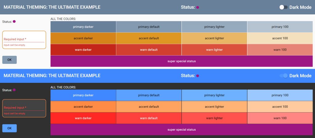
</mat-slide-toggle>Code language: HTML, XML (xml)Congratulations! You should now be able to do stuff like this:
This should serve you well for most use cases. However, there’s of course still cases out there that make maintaining our goals a challenge. One such case that I haven’t fully solved myself is the inclusion of external components that you can’t access the CSS or HTML of but only style via some configuration object in TypeScript. I have a running solution that makes static business colors available in TypeScript, but I haven’t gotten around to making the same work for dynamic color palettes. On the off chance that you’re interested in my approach or want to share your own solution, feel free to contact me.
Naturally, I didn’t come up with all this out of the blue as much as combine and build on the work of others. Here are the resources that I found most helpful:
- The official theming guide by the Material team
- A great step-by-step guide by Pascal Precht – not as extensive as this, but more in-depth
- A complementary article by Tomas Trajan, providing some missing pieces